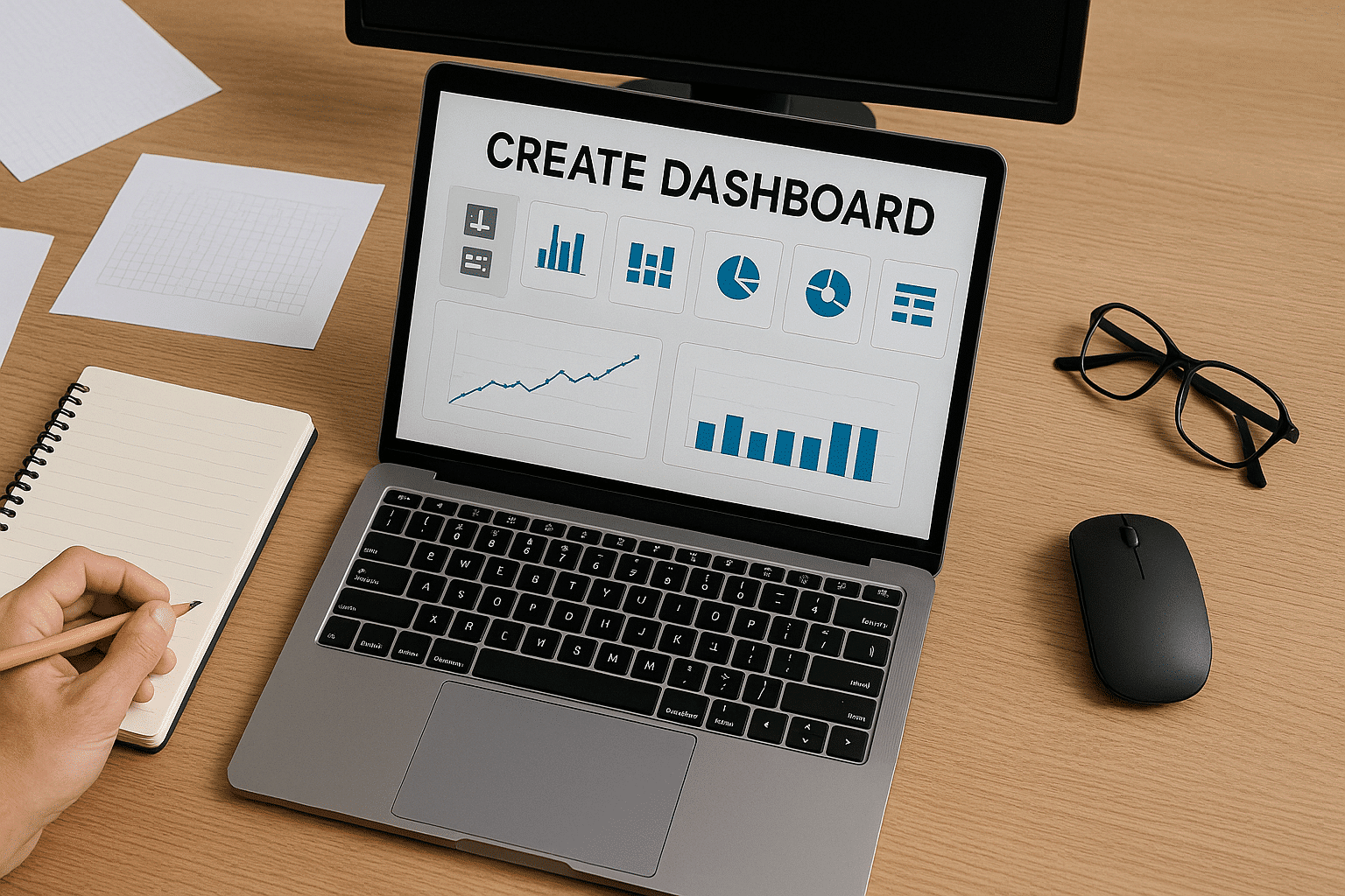
Are you looking to better manage your activities, but your data is scattered and difficult to interpret? Creating a dashboard is the ideal solution to centralize information, monitor your indicators in real-time, and make informed decisions. In this article, learn how to create a relevant, clear, and customized dashboard.
What is a dashboard?
Definition
Before designing anything, let’s take a moment to understand what a dashboard really is, commonly referred to as a dashboard.
A dashboard is a visual tool that summarizes your key data into a clear, often graphical interface. It allows you to see at a glance what’s working, what’s deviating, and what requires your attention. Practically, everything is at your fingertips, making it easy to access your business data.
Our opinion: It’s an indispensable tool for anyone aiming to manage a project, an activity, or a business with method and clarity.
What is a dashboard used for?
If you’re still wondering about its benefits, here are the concrete advantages:
Continuous performance monitoring without the hassle of sifting through extensive Excel sheets.
Quickly identifying discrepancies between your targets and actual outcomes.
Streamlining communication between teams or with stakeholders.
Facilitating decision-making, thanks to a comprehensive view.
Achieving clarity, where raw data often leads to confusion.
Centralizing information so you’re no longer operating in the dark.
In short, a good dashboard saves you time, peace of mind, and better insight into your data.
In what contexts to use it? (HR, finance, marketing, etc.)
A dashboard is a cross-functional tool utilized across various fields. Here are some examples to better visualize its usefulness according to different professions:
Service / Department
Dashboard Usage
Example Indicators
Human Resources (HR)
Monitoring employees, training, and workplace well-being
Turnover rate, absenteeism, number of trainings completed
Finance
Budget control, profitability, and financial forecasting
EBITDA, net margin, expenses by category
Marketing
Tracking campaigns and customer satisfaction
Click-through rate, conversions, advertising ROI
Production
Optimization of lead times, costs, and quality
Reject rate, cycle time, productivity
Management / Strategy
Overall performance management and strategic planning
Global KPIs, cross-departmental insights, summary dashboards
Key performance indicators, or KPIs, are crucial to any data-driven strategy. Without them, you’re navigating in the dark.
Building a dashboard enables you to consolidate your KPIs and track them regularly. You’ll know if your actions are yielding results or if you need to adjust your efforts. Don’t let your data languish in an Excel file. Give them a strategic role!
To gain visibility and responsiveness
A robust dashboard provides you with immediate visibility of your operations. You can instantly determine whether everything is running smoothly or if corrective measures are needed.
This comprehensive view allows you to respond faster, eliminating the need to wait for the next monthly report.
To facilitate decision-making
You know it – making decisions based on “instinct” is no longer sufficient. A dashboard provides you with a concrete, reliable, and updated basis to make informed decisions.
You gain objectivity, better anticipate issues, and most importantly, you can justify your decisions more easily to your team or management.
What are the different types of dashboards?
Before building a dashboard, you should determine its intended purpose. Here is a clear comparison to help you understand more clearly.
Dashboard Type
Main Objective
Update Frequency
Example Indicators
Operational
Track daily actions
Daily or weekly
Processing time, action volume
Strategic
Guide long-term decisions
Monthly or quarterly
ROI, customer satisfaction, overall efficiency
Financial
Control economic results
Monthly or at each closing
Revenue, margin, profitability
Sales
Manage sales performance
Weekly to monthly
Sales, conversion rate, average basket
HR
Improve personnel management
Monthly
Absenteeism, turnover, salary cost
As you can see, each dashboard has its specific function. If you manage a field team, the operational dashboard is likely what you’re looking for. If you focus more on business strategy, the strategic dashboard will provide a crucial overview. The financial dashboard is essential for maintaining budgetary guidelines, while the commercial dashboard helps adjust your actions based on outcomes. For HR purposes, as your company scales, the HR dashboard becomes indispensable.
Now that you have a clearer picture of the main dashboard categories, let’s proceed to building one step by step.
How to build a dashboard step by step?
Creating an effective dashboard involves more than assembling a few colorful charts. It’s a structured approach you can follow step by step.
Step 1 – Define the dashboard’s objective
It all begins with a question: What is this dashboard for? You need to determine who will use it, why it’s needed, and what it should highlight. The clearer the objective, the more effectively you can construct a tool that is not just visually appealing but also practical.
Step 2 – Identify the appropriate performance indicators
There’s no need to overwhelm with an abundance of figures. Select relevant KPIs compatible with your objectives. If you’re uncertain, ask yourself: “Does this indicator truly aid in my decision-making?” If not, exclude it.
Step 3 – Select the correct data sources
Your data must be reliable, up-to-date, and useful. Collect them from your CRMs, ERPs, or internal databases, ensuring they are current. An outdated dashboard can lead to poor decisions, which is a major pitfall.
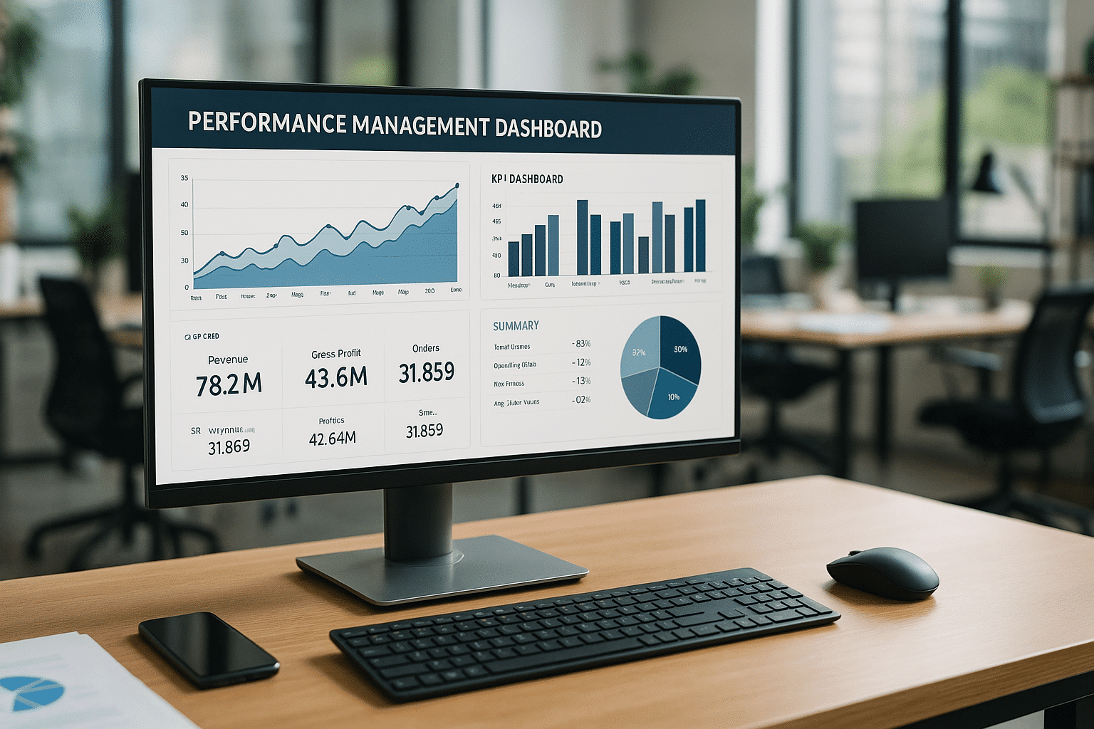
Step 4 – Organize the information
Structure your dashboard systematically. Group data by theme, prioritize sections, and enhance readability. Users should instantly grasp what they’re viewing, or they may lose interest.
A good chart is more valuable than a lengthy explanation if you choose the right one.
Types of charts
Lines highlight trends over time, bars compare volumes, pie charts demonstrate distribution. When applicable, maps illustrate geographical context.
Color choices
Avoid the temptation of a rainbow effect. Use distinctive colors: green for positive trends, red for issues, and neutral tones for everything else. This allows for intuitive comprehension, even at a quick glance.
Step 6 – Test, evolve, and update regularly
Your dashboard is a dynamic entity, not a static item. Test it, gather feedback, and continuously improve it. As objectives and data evolve, so must your dashboard. Failure to update it will render it obsolete.
Rules to know for an effective dashboard
Designing an excellent dashboard doesn’t rely on flashy aesthetics; it’s primarily about clarity, organization, and pertinence. To ensure your dashboard truly serves a purpose, you must adhere to several key principles.
The 5-second rule
An effective dashboard is discerned immediately. The essentials should be understood in under five seconds. This is known as the 5-second rule. If one has to ponder, search, or scroll to capture the core information, the dashboard isn’t sufficiently clear. Your brain should immediately perceive the priorities. This is the first element to assess, whether for a manager or a client.
Simplicity and information hierarchy
Clarity is key, so avoid unnecessary embellishments and arrange data by importance. Present what’s crucial first, followed by additional information. If everything is displayed equally, it can overwhelm the reader. Simplicity doesn’t imply lacking depth, but enhancing readability. A well-structured hierarchy facilitates easy navigation, even if skimming through the dashboard.
Adapting design to your target audience
A proper dashboard is designed for its users, not its creator. For executive audiences, be concise, visual, and impactful. If it’s for operational users, provide more details, precision, and context. Tailor the language, information density, and level of interactivity. The relevance of design lies here. Ignoring this step risks creating a useless tool, even with flawless data.
What tools to create a dashboard?
Today, creating a dashboard doesn’t require developer skills. Depending on your needs, technical skill level, and resources, several options are available. Some are simple and accessible, while others are more robust and complex. Here’s how to make the right choice.
Excel – the accessible base for everyone
Excel remains a dependable choice. For beginners or individuals working solo, it’s the most straightforward tool. You can design clear tables, insert formulas, generate charts, and even incorporate interactive filters. While it may lack automation and real-time data source connectivity, it suffices for internal purposes. We believe it’s an excellent starting point.
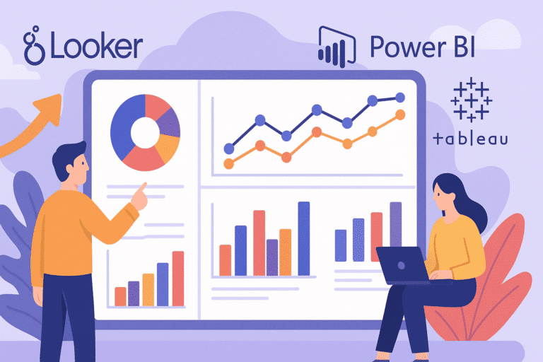
Power BI, Tableau, Looker – professional solutions
As your needs expand, consider transitioning to Business Intelligence tools like Power BI, Tableau, or Looker. These platforms enable you to connect your databases, create dynamic visualizations, and share your dashboards online. Power BI is ideal in a Microsoft environment, Tableau excels in graphic richness, and Looker is outstanding for model-oriented logic. While powerful, they require some learning. In a data team context, they significantly enhance productivity.
Free alternatives – advantages and limitations
If you’re seeking a free solution, consider Google Looker Studio (formerly Data Studio), Metabase, or Grafana. Google Looker Studio is intuitive and connects with Google tools. Metabase suits SQL dashboard generation without coding. Grafana is powerful for visualizing technical or real-time metrics. However, these tools have limitations: lack of customization options, sometimes complex interfaces, or absence of certain advanced features. Ambitious or decision-maker-oriented projects might quickly hit constraints.
Conclusion
A well-designed dashboard is more than a visual tool; it’s a strategic asset. It allows you to gain clarity, monitor your KPIs in real-time, and most importantly, make decisions aligned with your goals. Whether you use Excel, Power BI, or Looker Studio, the key is to tailor your dashboard to your needs, data, and audience. Begin simply, structure thoughtfully, test consistently, and always remember: a good dashboard should drive action, not merely serve as decoration.
Become a Business Analyst
The newsletter of the future
Get a glimpse of the future straight to your inbox. Subscribe to discover tomorrow’s tech trends, exclusive tips, and offers just for our community.
Take your future into your own hands. Choose your desired start date, and begin your application by filling out the appointment form.
Bootcamp
Tuesday 7 July 2026
Analytics Engineer
Remote
English
Bootcamp
Tuesday 8 September 2026
Analytics Engineer
Remote
English
Bootcamp
Tuesday 3 November 2026
Analytics Engineer
Remote
English
Upcoming starting dates
Take your future into your own hands. Choose your desired start date, and begin your application by filling out the appointment form.
No upcoming dates
THE TEaM
They won’t leave until you land your dream job and celebrate with you 🍾
Liora is more than a training. It’s a whole team walking forward with you, step by step, until you get hired. Mentors, coaches, instructors… all committed to your success.
Estelle
Career Associate
Vincent
Career Associate
Magali
Career Associate
Bilal
Career Associate
Kahina
Career Associate
THE SUPPORT
Support built for your success
Our structured support and expert training open real career opportunities in data, cyber, and tech.
Premium resources just for you
A private platform with exclusive insights on market shifts and career strategy.
A Slack space to log in, ask questions, and grow with fellow learners.
Stay updated with expert tips on trends, events, and career moves.
Individual career coaching, tailored for you
From day one, our Career Team supports you with personalized coaching. We help you:
Shape your career path around your goals and experience.
Find the right opportunities and fine-tune your job search strategy.
Get personalized advice to level up your job hunt.
High-impact career workshops
Our expert-led group sessions help you prepare for the job market: from polishing your CV and LinkedIn to nailing interviews, building a smart job search strategy, crafting your pitch, and building your network.
A strong network that opens doors
We connect you with recruiters through job fairs, speed-dating sessions, and curated industry events.
The impact of our support in numbers
52k€
Average gross salary of our alumni
Real proof that our programs lead to high-quality, high-paying jobs in data, tech, and AI.
9.53/10
Satisfaction for individual coaching
With 1000+ coachings delivered each year, our live support gives you direct access to industry experts to ask, unblock, and accelerate your job hunting process.
9.1/10
Satisfaction for group workshops
Hands-on sessions that help you improve your CV, LinkedIn, interview skills, and job search strategy.
71%
Employment rate
within 6 months of graduating a clear sign of how effective our training and career support really are.
70+
career-focused workshops every year
covering key topics like employability, networking, career transitions, and personal branding tailored to every learner.
4
recruitment fairs per year
Whether online or in person, these exclusive events create real connections between our talent and recruiters.
They benefited from our Career Support
Great Training Bootcamp! Thanks to the way Datascientest teaches and the constant support provided by the teachers, I was able to get the practical da…
James
I learned a lot in the program it is really an amazing platform to grow with your career and start with potential. I really felt helped and received a…
Rajini Sharma
I am really amazed by the human quality of the Hack A Boss team, Selene, Dmitry, Pablo and Daniel are amazing people who are willing to help and teach…
Simon Cariou
I recently finished my Bootcamp for Data Analyst and I am very happy with the knowledge I gained and experience it gave me. The modules were very clea…
Matea Mutz
I find this platform is the best because it's an intelligent way of learning in this era, just text content plus some needed short tutorial videos. al…
Ahmed
I am really amazed by the human quality of the Hack A Boss team, Selene, Dmitry, Pablo and Daniel are amazing people who are willing to help and teach…
Lautaro Martinez
Just finished training yesterday (3 + 2 days). Group interactivity was effective, the instructor was very responsive. His experience in business as co…
Stéphane Bourain
Finance Controller
I would like to share with you a great experience lived recently by following "Data Analyst Training". I have learnt lots of skills (Python, Data Anal…
Khalid
Very high-quality training. Thank you for the presentation. I strongly recommend this training provider. It covers nearly all the key aspects needed t…
Mohamed Haijoubi
Data Engineer
I completed a Data Engineer training program at DataScientest, and overall, the course is well-structured — a balanced mix of projects, theory, and …
Moustafa B
SRE Lead
Now certified and very satisfied with the Data Scientist training, I’ve decided to continue my journey with DataScientest by enrolling in the MLOps …
Alexandre L
An excellent training provider for Data-related careers. The courses are well-designed, and you’re quickly challenged through exams after each modul…
Rémy
The training offers a solid overview of various Machine Learning techniques, and access to a wealth of content — including coaching sessions, alumni…
Anonymous
The bootcamp program is really intensive, specially for a person who has no programming background, but the course is definitely worth it. It helped m…
Shiva
As part of my career transition, I pursued my DevOps training through a work-study program at DataScientest. I chose to follow both courses with DataS…
Nicolas Utter
Content Creator
Awesome education, awesome people.
Alexander P
I'm delighted to share my experience with this bootcamp! After completing my bachelor's degree, I was searching for a way to work with computers and d…
Dotun Olujide
A lot of things to learn and a lot of information! was an amazing experience.
Tiago R
I’d like to share my feedback following the high-quality training I completed on Microsoft Power BI, delivered by DataScientest. This experience was…
Anonymous
Excellent course with practical focus! Really enhanced my data science skills, directly applicable to my research. Highly recommend DataScientest for …
Lina Livdane
Overall impression is good. The course content is well-organized, thoroughly designed and challenging as well. In the end, I believe I am well-prepare…
Khoa Tran
I really enjoyed the course material and the fact that everything was remote. Well I haven’t finished the MLOps part yet. The data science part was …
Marius
Onboarding was smooth & lessons on your own & remote were particularly adequate to me
Clément Dué
Loved the format which was perfect for me – as a young parent. Additionally, I found the resources (platform) to be very good, and the instructors to …
Christian Müller
AI Scientist
I successfully completed my Data Analyst training last month and was very satisfied — within just six months, I was able to learn the key fundamenta…
Henry
Angelika Tabak
DataScientist.com is always interested in maintaining a good reputation and producing good graduates. But don’t be afraid, the instructors are very …
Baris Ersoy
PL/SQL Developer
I’m really glad I chose DataScientest. Balancing work, family, languages – and now data – learning is challenging, and their flexible format makes i…
Debora Ferreira
Probably the best Data & AI training course out there. Loved the structure, depth and hands-on approach of the Data Science & MLOps course. I …
Benjamin S.
Data Scientist
The content of the module undoubtedly covers the most important aspects of Machine Learning and MLOps. The final project allows you to put into practi…
Darwin Oca
As a seasoned software engineer with many years of experience, I was looking to refresh my IT skills and deepen my knowledge in data-related technolog…

 As you can see, each dashboard has its specific function. If you manage a field team, the operational dashboard is likely what you’re looking for. If you focus more on business strategy, the strategic dashboard will provide a crucial overview. The financial dashboard is essential for maintaining budgetary guidelines, while the commercial dashboard helps adjust your actions based on outcomes. For HR purposes, as your company scales, the HR dashboard becomes indispensable.
Now that you have a clearer picture of the main dashboard categories, let’s proceed to building one step by step.
As you can see, each dashboard has its specific function. If you manage a field team, the operational dashboard is likely what you’re looking for. If you focus more on business strategy, the strategic dashboard will provide a crucial overview. The financial dashboard is essential for maintaining budgetary guidelines, while the commercial dashboard helps adjust your actions based on outcomes. For HR purposes, as your company scales, the HR dashboard becomes indispensable.
Now that you have a clearer picture of the main dashboard categories, let’s proceed to building one step by step.